Dec
CREATING A NEW BUSINESS IDENTITY FOR VACATION HOUSES ‘NAXOS AFFINITY VILLAS’
A group of 5 holiday homes, the “Petroto Abodes” stand 1.5 km from Plaka beach and the coast amidst the natural landscape of the Naxian plain.
Positioned as it is so near to Plaka beach, and yet just far enough away to escape the summer bustle, the complex is the ideal location for a quiet and relaxing holiday surrounded by nature and the local flora. It really is the ideal ‘family escape’.
Throw in a few luxuries like a tennis court, a playground and a fully-staffed swimming pool, add a garden planted with olives and citrus fruits around the perimeter of the holiday homes, and you have the perfect recipe for a carefree break in a warm and friendly, homely and comfortable atmosphere.
When working on the new name, we would have to bear in mind the owners’ philosophy of providing hospitality at a site whose charm and attraction stem from a sense of spending time in a relaxed, calm and homely environment, rather than being accommodated in a classic tourist block.
But the whole “Petroto Abodes” experience, the way holiday-makers took it into their hearts and felt so totally at home there—everything, in short, in the DNA of the place that made it what it is—had little or no connection to its corporate identity.
Given that the owners wanted to promote the residences in a targeted way, with a view to developing long-term, personal relationships with visitors who would come back year after year, the overall image and identity of the villas would need a rethink.
As a place name, a trading name and a logo, “Petroto Abodes” adds nothing positive in terms of what it conveys. In fact, the old-fashioned, near-incomprehensible name communicated nothing at all, while the logo was unduly complex and utterly disconnected from both the island and the business’s philosophy, style and strategy.
Which is why the owners came to us for a total make-over: they gave us free rein to design a new logo from scratch and come up with a new name.
Our primary goal was to reposition the identity so it conjured up mental images of traditional, Cycladic holiday homes equipped with the finest-quality facilities and every mod con, with a dynamic powerful enough to drive further development and attract new clients, and yet retain an intense emotional pull at the same time.
When working on the new name, we would have to bear in mind the owners’ philosophy of providing hospitality at a site whose charm and attraction stem from a sense of spending time in a relaxed, calm and homely environment, rather than being accommodated in a classic tourist block. What they offered was an environment in which the visitor experiences the warmth that will bind them emotionally to the place by making them feel that it was now, somehow, home.
Which is when we decided that we would also need a new tagline to accompany the new logo, one that could further reinforce the identity and communicate the philosophy, feel and style of the complex more effectively.
This was the background against which OPEN UP Communications’ creative team came up with their initial proposals, which also included a new slogan.
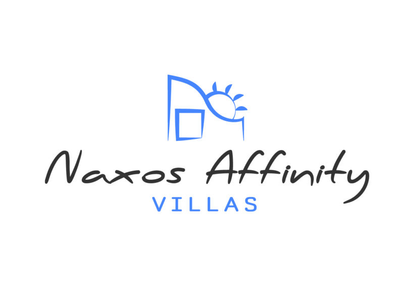
Management accepted the proposals and approved the new name for the complex: Naxos Affinity Villas. Accompanied by the tagline “Embracing moments”, a clear tone of renewal had been set.
Visually, the proposal that won out and was approved encapsulated a unique approach: intense with simple lines, a laid-back low-key design, a palette and a font that literally cried out leisure, familiarity and fun—in short, a hassle-free summer break.
Its architectural element typical of traditional island, and specifically Cycladic, buildings with the sun rising behind it, arouse intensely positive responses and associations with holidays rooted in simple, unfussy, functional and high-quality hospitality—characteristics all that apply just as well to Cycladic architecture.
The light blue also helps communicate those same features of a tranquil, laid-back, warm and welcoming stay in a homely island environment, while also referencing the Aegean Sea.
OPEN UP Communications team finished up by creating a concise brand manual, with instructions on how to use the new logo and some suggestions for possible applications.
We are particularly happy to have brought this project to such a successful conclusion, and are delighted with our clients’ unreserved acceptance of and satisfaction with the outstanding result. We would like to thank them for entrusting their business to OPEN UP Communications.

